Paul Fitzpatrick: September 2023

Here’s a question… have you ever bought an album purely because of the artwork?
Age 14 I knew next to nothing about art, in fact Caravaggio could have been the starting centre-back for Inter Milan as far as I was concerned.
My art knowledge really was restricted to a few scraps….
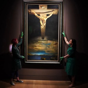
I knew a little bit about Salvador Dali because his Christ of Saint John of the Cross painting was centrepiece at the Kelvingrove Art Gallery & Museum in Glasgow.
I’d heard of Leonardo Da Vinci because of the Mona Lisa, but then I only knew about the Mona Lisa because my Mum played the Nat King Cole song so often I was driven to find out who the song was about.
And, inspired by Don McLean’s “Vincent”I had watched the movie Lust for Life starring Kirk Douglas as Van Gogh to learn that Johann Cruyff wasn’t the only Dutch master of note.
Yet, I had no idea despite multiple visits to the Kelvingrove Art Gallery, that they housed paintings by the likes of Van Gogh, Rembrandt and Turner…. probably because as kids we were more interested in the vintage WW2 Spitfire hanging from the gallery roof, the stuffed elephant in the west court and the goodies in the cafeteria.


However, without knowing it at the time, a lot of us actually did have an appreciation of art.
Not the type hanging in galleries (that would come later) but the art-form that embellished record sleeves from the late 60s thru the 70s and beyond.
Noel Gallagher made the point recently that album artwork is “the poor man’s art collection”, which will resonate with a lot of the record buying public from the 70s.
The first album sleeves that captured my attention were predictably the Beatles.
Growing up in the 60s you couldn’t escape the fab four and album covers like Sgt Pepper and Magical Mystery Tour were the equivalent of watching colour tv for the first time.
Amusingly, from roughly the same period, I hold fond memories of the Pickwick, Top Of The Pops compilation album covers, (come on, I was going thru puberty!)
But then that’s the thing about art, it’s all in the eye of the beholder – for every Peter Blake there’s a Jack Vettriano.


Pioneers in most things, the Beatles along with Warhol’s Velvet Underground, were among the first to recognise the potential of the album sleeve as a visual representation of the music
Suddenly, album covers had permission to be as innovative as the songs they encased, and this led to a slew of ambitious young creatives enlisting into the music industry.
A few of these young bucks would go on to make a big impact, creating some of the most iconic album covers of our time whilst successfully building empires and reputations along the way.
Roger Dean, who designed the original Virgin logo specialised in creating immersive worlds and provided the fantastical images for Yes, Osibisa, Asia, Uriah Heep and a heap of other prog-rock artists.
Dean’s artwork was instantly distinguishable but fortunately listening to 80 minutes of Yes’s – Tales from Topographic Oceans, wasn’t compulsory to appreciate the art.
As Dean put it himself….
“it was a very, very brief period in history when the album cover art and the music came together to make something that was the perfect gift.
And it was, a perfect gift”

The 70s was the golden period for vinyl, you really did get a lot of bang for your buck… gatefold sleeves, liner notes, lyrics and spectacular art that in Dean’s case was every bit as surreal as Salvador Dali.
Storm Thorgerson, also a Brit, was another giant within the industry and a great example of being in the right place at the right time. Not only was he a talented graphic designer, he also had a couple of close mates who would go on to form a band called Pink Floyd.

Thorgerson designed 20 album covers for Floyd including the iconic Dark Side of The Moon sleeve which propelled his design company, Hipgnosis, co-created with partner Aubrey Powell, into the limelight.
Throughout the 70s they were constantly in demand, creating some of the most iconic album sleeves for artists like, Led Zeppelin, 10cc, ELO, Bad Company, Genesis, Wings and Queen.
A great documentary about Thorgerson, Powell and Hipgnosis called ‘Squaring The Circle’ has just been released which if you’re into album art, is well worth a watch.
A tad niche but still a personal favourite of mine was Neon Park, an American artist who designed the majority of Little Feat’s covers along with albums for Bowie, Zappa and the Beach Boys.
Park had a surreal, comic book style which included a bizarre fetish for drawing humans with huge duck bills – no me neither, but it kinda worked.

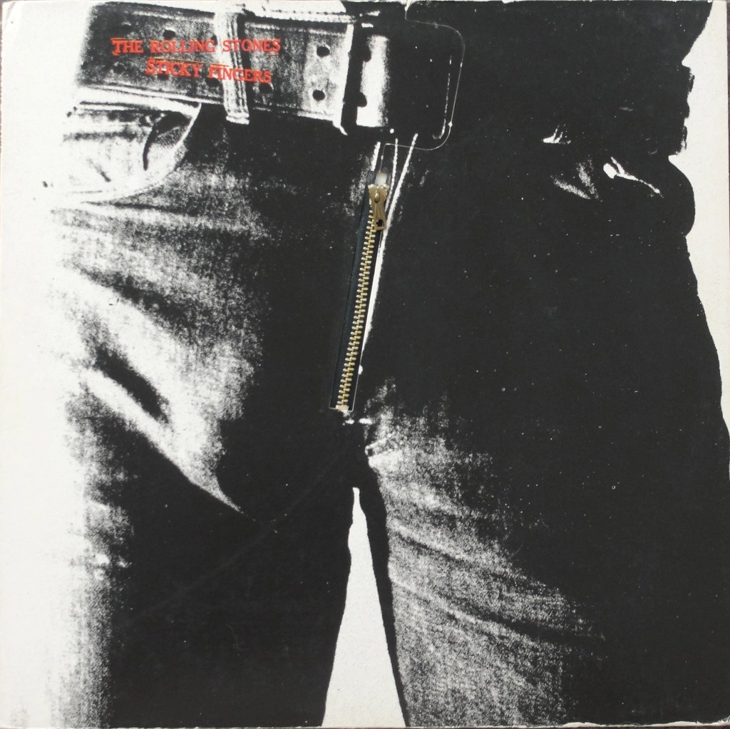
Personally I was always a sucker for a gimmicky album sleeve, I loved the authentic denim zip on the Stones Sticky Fingers cover, I had hours of fun with the spinning wheel idea on Led Zeppelin 3, and I thought the die-cut sleeve concept on Physical Graffiti was genius.

When it comes down to it, I do have a favourite all-time piece of cover art, which is Marvin Gaye’s 1976 I Want You album.
It always helps when you love the music too.
The cover art for the album actually comes from an original 1971 painting by American artist Ernie Barnes called The Sugar Shack.
When Gaye requested permission to use the The Sugar Shack painting Barnes who was a fan, personally recreated it for the album by replacing some of the hometown references he’d included on the original with references relating to Gaye’s album.
The original 1971 Sugar Shack painting is now owned by Eddie Murphy who bought it for $50k from Marvin Gaye’s estate. A duplicate created by Barnes in 1976 recently sold at Christies for over $15 million so god knows how much Murphy’s 71 original is worth.
I love the album and the cover so much that my family commissioned an artist to recreate it as a surprise for my 40th birthday and it hangs in our living room alongside some other Ernie Barnes prints.

So, getting back to the question, “have you ever bought an album because of the artwork”.
In the autumn of 72 I stood in a record shop with with two albums in my hand but with only enough money to purchase one of them.
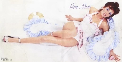
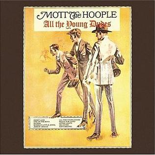
Roxy Music’s debut album and Mott the Hoople’s All the Young Dudes.
Logically I should have bought Mott’s album as it featured the title track which was a favourite whilst for some bizarre reason Roxy’s debut failed to include the song that had broken them, “Virginia Plain”.
But there was something about the Roxy gatefold sleeve that swayed me the content looked way more interesting, so based purely on the aesthetics I plumped for Roxy.
Ironically, Kari-Ann Muller the model on the front of the Roxy cover would later feature on the cover of Mott’s 1974 album The Hoople, so Ian Hunter and the lads must have agreed too!


Discover more from
Subscribe to get the latest posts sent to your email.

Great post! I think the biggest thing i miss about vinyl compared to CD is NOT the sound but the size of the packaging and the artwork. A 5″ square version of Sgt. Pepper doesn’t match the 12X12″ edition of it. Of course, now with digital we get squat if you go that route. And what’s more, when CD took over the market place, it seemed like a lot of artists stopped putting thought into the art. It’s a shame. Thorgerson was brilliant, I’m going to try to see that film. As for your question – I don’t know that I ever bought an album just because of the cover art, but I do think when I was getting into Roxy Music in a big way, around ’80 probably, I had their Greatest Hits, I had Flesh + blood (the current one at the time), and knew I wanted to get the rest – I think ‘Country Life’ was my first choice based on the cover! In time I’d collect them all.
LikeLiked by 1 person
Thx Dave, yeah I had the Country Life cover up on my wall in 74!
I could have done a whole piece on ‘exotic’ album covers – maybe I will 😄
LikeLiked by 1 person
I had a theory, might’ve been total BS, but I believe it…a big part of reason why REM didn’t do as well with ‘New Adventures in Hi-fi’ after going multi, multi platinum on ‘Monster’ was the cover. It had a tasteful, but not eye-catching BW landscape. ‘Monster’ had that bizarre, static-y bear head on bright orange background. That one caught your eye. ‘New Adventures ‘ didn’t. Record store managers quickly moved it off front racks & wouldn’t hang up the posters WB gave them, or put window clingers up…one manager gave me one, ‘I ain’t gonna put it up, you want it, no problem’. Didn’t destroy the record but I think it did lose them sales & chart positions.
LikeLiked by 1 person
You’re preaching to the choir Dave, I worked in branding and the power of packaging and presentation is massive, plus as the saying goes…. ‘sex sells’
LikeLiked by 1 person
Billion Dollar Babies was a good cover. Still got mine complete with the fake bill inside.
LikeLiked by 1 person
That was a truly special, thoughtful gift from your family.
The Moody Blues commissioned artist Phil Travers to paint their gate-fold album covers. I used to think about getting mine framed as wall art. This has me renewing that thought.
LikeLiked by 2 people